Showing posts with label fall card. Show all posts

Wednesday, October 18, 2023

Pumpkin Girl

Today I made two cards that feature a Pumpkin girl from the stamp set, Seasons of Fun, a set from a few years ago.  For Halloween this year, my g-baby will be dressing up like a pumpkin and I wanted to send her a fun Halloween card.

For this card, I used Copper Clay for the background cardstock and added some All About Autumn designer papers to it.  These papers have been out of stock for a while and I wish that had ordered more at the beginning of the season!  I just love them so much.  

I added the little Pumpkin girl, colored her in using Stamping Blends and Wink of Stella to make her shine.  I added the little dog from Seasons of Fun and some cut-out leaves for embellishment.  The saying is from Pick of the Patch stamp set, in the current Mini Catalog.  I think she looks so sweet skating across this card. :)

For my next card, I started with Pumpkin Pie cardstock and added a designer sheet from Let's Go Fishing papers.  I liked the addition of the new color, Pebbled Path and I cut out a couple of tags using the same two colors.  

This time, I cut out the image of the Pumpkin girl and added Happy Halloween and a little pumpkin from the Pick of the Patch set.  

Which of the two cards do you like best?  I had fun playing with some fall stamps and papers today.  


Friday, October 14, 2022

Soft Seedlings

In  my stamping class this week, we used the Soft Seedlings stamp set from the mini catalog.  I used Calypso Coral cardstock for the base, embossed the next layer with the Timeworn Type embossing folder and added a piece of the gold dotted papers from the last Sale-a-Bration.  

I colored stamped the leaf image using Calypso Coral ink and then added some Tangerine Tango ink with a sponge dauber on the outer leaf edges.  I cut it out and added it to my card.  I got the idea for this card from Angela Meiritz-Reid.  Both of the cards are from the same cardstock; it's just the photos that make it look different.

The next card idea is from Cheri Stojkovich.  She stamped the image onto vellum cardstock and then heat embossed it with clear powders.  I love how this came out.  The bottom layer is Powdered Pink that is embossed with the new Leaf Fall folder.  

Because of it's shiny gold on the edge, it's hard to get a good photo of it.  Here you can see the soft layer of the vellum on top of the pink layer.  The two layers are adhered only on the left side of the card to give the vellum a more free-standing look.  

I used Soft Suede ink pad for the image and added some Cherry Cobbler ink to the edges of the leaves with the sponge dauber.  When you heat up the image using the clear powder, it really brings the colors to life on this card.  Honestly, the photo does not do it justice.

This third card is made using white embossing powders on a shimmery piece of cardstock.  I then sponged some Calypso Coral onto the paper.  Then I wiped off the ink from the embossed image, leaving the white image to stand out better.  I added some brown speckles to the front to give it some dimension.  I love this idea from Diane Vander Gallen.  

The fall cards for this week's class were made using corals and tans.  I love how different the tones are on them and how they came out.  What about you - are you using some "different" colors on your fall cards this year?


Monday, October 3, 2022

I'm Fond of Autumn

Here is upstate NY we had a very hot summer with 25 days over 90 degrees, which is very unusual for us.  (Last year we had 4.)  But on the first day of fall, the weather changed dramastically and since then we have had very cool weather.  The leaves on one of my trees have already fallen and it definitely feels like autumn now.  

So this week I took out a new fall set called Fond of Autumn.  And I have to say that I loved it!  It has some nice fall images of leaves and acorns, but it also has a lot more to offer.  

I started with this Cajun Craze fall card with a side "door opening."   I used a sheet of the pumpkin paper from Gilded Autumn designer papers that we offered last year in the fall.  The image is colored in with Stamping Blends using the Crumb Cake for the leaves and cut out with the die cuts.  I love the soft colors for this card.  I added a vanilla circle for the Thank You saying.  I got the idea for this from Melissa Faust.  

Next up is a card using Pear Pizazz for the background.  I used the die cut from Hues of Happiness and tucked a sheet of designer paper behind the cut out for a subtle look.  The tag is from Designer Tags cut outs and looks great as the background behind the leaf cut out.  I colored in the leaves using watercolor pencils and added a slight water wash to them to blend in the colors.  My idea came from Debbie Henderson.

For this card, I used the birch folder to emboss some trees onto the circular cut out for the background.  I think the cut out is one from a wreath, but I'm not sure which one.  I embossed the Old Olive background piece with the Timber folder and put it onto a card base and envelope from the Sale-a-Bration Cards and Envelopes.  I wanted to keep the color scheme green and crumb cake.  This idea is from Mikaela Titheridge.  

Even though all three cards have a fall look, this stamp set can be used into Christmas and throughout the year.  It also has berries that can be used as holly berries and flowers that can be used all year.  I enjoyed using it.  


Friday, October 12, 2018

It's Like Walking Down a Country Lane

 Last week's stamping class featured a new stamp set, Country Home.  It has such sweet images in it, like a milk can and a retro pitcher.  The paper coordinates nicely with it, to bring out that sweet country feel.

The Tin Tile embossing folder has such an awesome look to it - it makes paper look like decorative metal tin.  We embossed some galvanized metal paper with the folder and take a look at the first card, especially in the first photo.  I love these colors together. 

The second card has cotton balls on it to complete the look of the cotton that is in the milk can.  I colored in the images using the Stamping Blends.  I love these cards so much - I think I need to make some more projects with these colors and this stamp set!

Rich Razzleberry is the shining color on this card, too.  I embossed the saying with white embossing powders to make it stand out. 

Finally, we stamped the milk can onto colored cardstock so that we didn't have to color it in.  A different look, but still a lovely card.

When I advertised this stamp class, I told the ladies that making these cards would like taking a walk down a country lane.  And boy, was I right!  :)


Monday, November 23, 2015

Fall Craft Fair

Here is another card that I made using the Thankful Forest Friends stamp sets.  Isn't the little bear so cute?  I love having him standing amongst the birch trees.  I embossed them and then sponged them with Soft Suede ink to make them stand out.  I love the colors of this fall card, too.  I saw the idea for this by Jari Francis on my favorite website, Pinterest.

I was in a craft fair a few weeks ago and brought some of my crafts with me to sell.  Here are more of the mini tote bags that I made.  I loved making them.  Next time I'd like to try making them a little smaller in Christmas colors to hang on the tree. 


Fun with the fall magnets:

Seeing my friends, meeting new people, and of course, selling my items is what makes craft fairs a lot of fun!

Did you find any new crafts or ideas that you liked at craft fairs this year?


Saturday, October 10, 2015

More Fall, More Fall!

 It is such a beautiful morning here in upstate New York.  The sun is shining and the weather is perfect.  I thought that it was time to post some of my fall cards.  And what better place to photograph them than outside?  So I took them out in the back yard to get some photos.  It was so nice, I almost didn't want to come back in!

Most of the time I see cards and ideas for projects on Pinterest.  I pin them and then modify the designs to make them my own.  But when I saw this card from Connie Babbert, I loved the colors so much that I made it almost exactly like she did.  Who would think to put Mint Macaron and Pool Party with Tip Top Taupe and Chocolate Chip colors for fall? 

It has a matching party favor pillow box using Mint Macaron.  I saw this idea from Sue Plote.  Don't they look just beautiful together?  Would you use this color for your fall crafting?

Of course the stamp set is Lighthearted Leaves! 

More Fall

I could make fall cards all year! Crazy as it may seem, I tend to like fall and Thanksgiving more than Christmas.  It's less commercialized and not quite so busy a time of year.

I got this cute acorn stamp set that comes with a punch (my favorite stamps all come with a punch!) and worked on this "acorn" card.  I loved using the acorn images and assembling them, but then I thought that the card needed a little something in the lower part.  I reverted back to the Lighthearted Leaves set that I just love!  Doesn't it look cute?  I got the idea for the card and the pleated ribbon embellishment from Wendy Weixler.

The Thinking of You card is using the Lighthearted Leaves!  Even though I have a lot of fall stamps, I just can't put that set down.  The idea for this card is from Kristen Kortonick that I found on Pinterest.  It has paper from Into the Woods paper collection.

I used chocolate chip for the browns in these cards.  I kind of like the monochromatic look of the greens and browns that they have.

What projects have you been making for fall?  


Beautiful Fall

If you know me at all, you know that I love fall.  It's the most wonderful time of year, when the air gets crisp and the trees glow with amazing color!

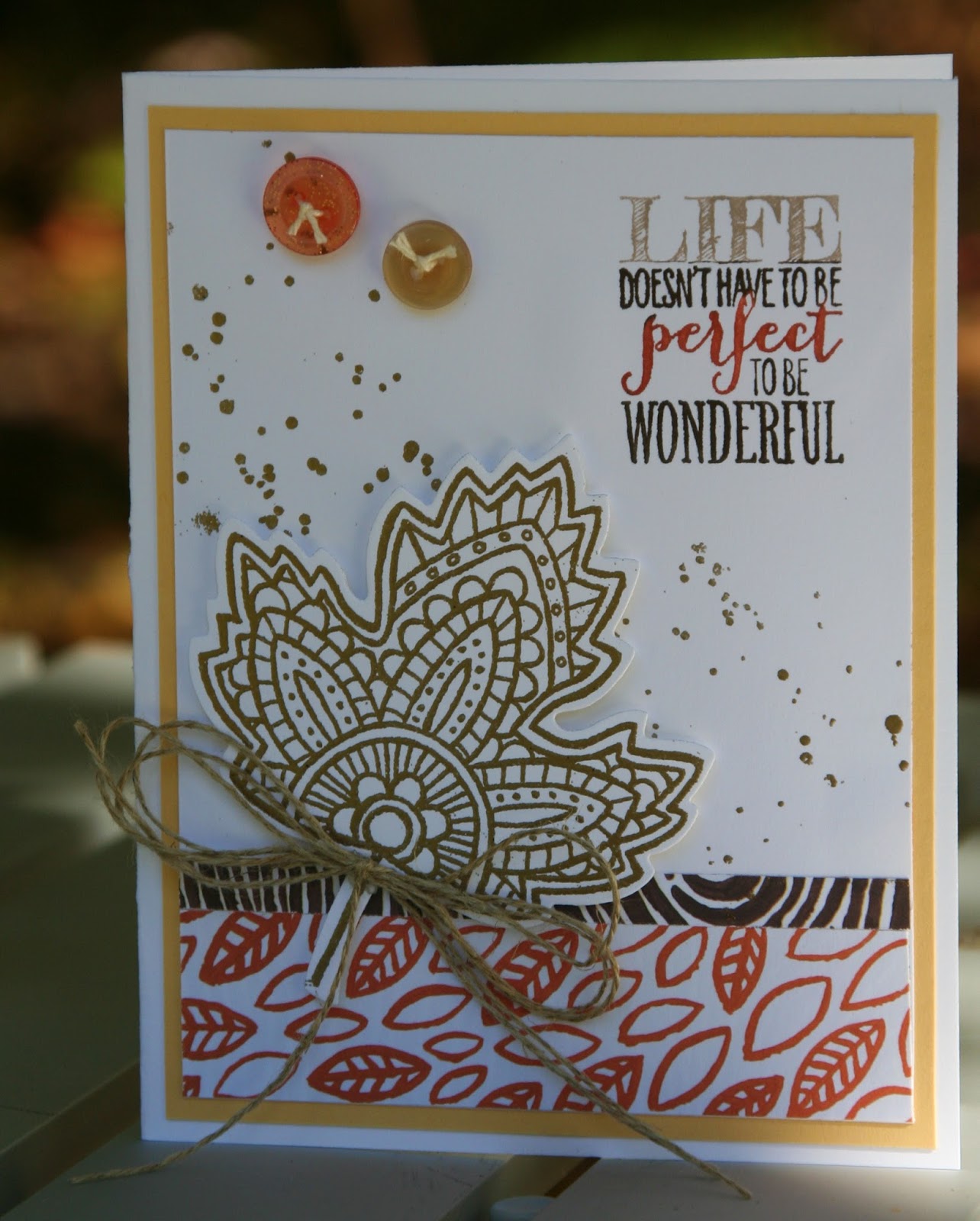
This fall I've been using the stamp set, Lighthearted Leaves, and I just love it!  It has a sort of whimsical, Bohemian look to it that I really like.  I got the ideas for the card on the left from Stampin' Up.  The leaves are die cut from Into the Woods designer paper.

The leaf image and the "sprinkles" in the background on this card are embossed with gold powders.  You can't really see it in the photo, but they shine and give the card "life."  I added the saying, "Life doesn't have to be perfect to be wonderful."  None of us has a perfect life, but we can choose to enjoy the blessings that we do have and in that way, it becomes wonderful.  :)

This card is my fav.