Showing posts with label timeworn type. Show all posts

Friday, April 12, 2024

Notes of Nature

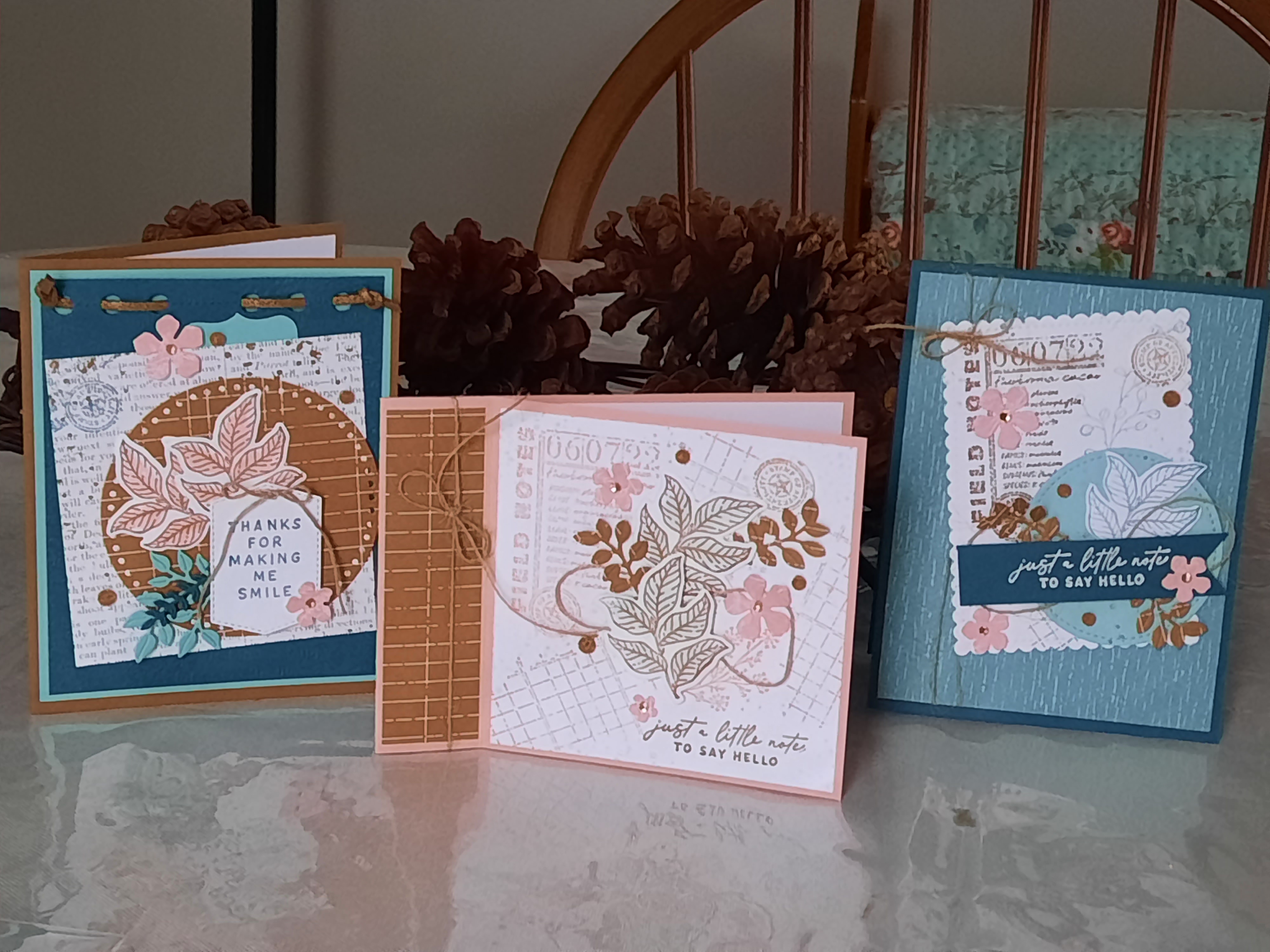
Last November at OnStage at home, Notes of Nature was one of the stamp sets that was shown by Shelli and her daughter.  I fell in love with the papers and stamp set.  This week I finally got a chance to take them out and make some cards with the!  

For this first card, I used some of the papers from Nature's Sweetness designer papers for the background.  I stamped a portion of one of the stamps onto the designer papers in the corner to make it look like a collage card.  

Then I cut the holes at the top from the Notes of Nature dies and embossed the Pretty Peacock paper using the Timeworn Type folder.   I threaded some Faux Leather Trim and knotted it at the top of the card.  I love the look of it.  

For the circle cut-out, I used Everyday Details die cuts.  I just love the look of the Pecan Pie color on this card.  I stamped the leaf image and colored it in with Petal Pink and cut out some flowers in the same color to coordinate.  

The tab at the top is part of a label punch.  It's supposed to look similar to a tab at the top of the card.  

My second card is made using Misty Moonlight for the cardstock and a piece from Inked Botanicals paper pack.  I stamped the background in Pecan Pie and added some embellishment to coordinate with the first card.  I used the little cork rounds on each of the cards.

The third card features a book fold opening.  I stamped onto the white background and added some leaves, sprigs, twine and flowers to complete the card.  I attempted to branch out with my colors this week- sometimes I use the same colors over and over.  I am proud of myself for using Pretty Peacock, Misty Moonlight, Coastal Cabana and Petal Pink together.  I love how they look.

Although I did look at some sample cards on Pinterest, the 3 cards are my own designs.  Now I just want to make more.  

What do you think of the collage look with this stamp set?


Friday, October 14, 2022

Soft Seedlings

In  my stamping class this week, we used the Soft Seedlings stamp set from the mini catalog.  I used Calypso Coral cardstock for the base, embossed the next layer with the Timeworn Type embossing folder and added a piece of the gold dotted papers from the last Sale-a-Bration.  

I colored stamped the leaf image using Calypso Coral ink and then added some Tangerine Tango ink with a sponge dauber on the outer leaf edges.  I cut it out and added it to my card.  I got the idea for this card from Angela Meiritz-Reid.  Both of the cards are from the same cardstock; it's just the photos that make it look different.

The next card idea is from Cheri Stojkovich.  She stamped the image onto vellum cardstock and then heat embossed it with clear powders.  I love how this came out.  The bottom layer is Powdered Pink that is embossed with the new Leaf Fall folder.  

Because of it's shiny gold on the edge, it's hard to get a good photo of it.  Here you can see the soft layer of the vellum on top of the pink layer.  The two layers are adhered only on the left side of the card to give the vellum a more free-standing look.  

I used Soft Suede ink pad for the image and added some Cherry Cobbler ink to the edges of the leaves with the sponge dauber.  When you heat up the image using the clear powder, it really brings the colors to life on this card.  Honestly, the photo does not do it justice.

This third card is made using white embossing powders on a shimmery piece of cardstock.  I then sponged some Calypso Coral onto the paper.  Then I wiped off the ink from the embossed image, leaving the white image to stand out better.  I added some brown speckles to the front to give it some dimension.  I love this idea from Diane Vander Gallen.  

The fall cards for this week's class were made using corals and tans.  I love how different the tones are on them and how they came out.  What about you - are you using some "different" colors on your fall cards this year?


Monday, August 1, 2022

Hues of Happiness

For this week's class, I used the Hues of Happiness paper and die cuts.  This card is my interpretation of the card on the front of the catalog.  I used the thick white cardstock for the card base and added a piece of the designer paper for the front.  I cut the edge of the white piece with the die cuts and ran it through the emboss machine using the Timeworn Type folder.  I cut out a couple of flowers from the beautiful papers and added some sprigs made from vellum that I punched out using the Bough punch.  

The saying is from Peaceful Moments and it is cut out with a die from Tasteful Labels.  I used Wink of Stella on the flowers to make them shine and added some rhinestone embellishments.  I could make this card all day!  LOL

For this next card, I used Highland Heather for the cardstock and added a white layer cut out using the die cut from this set.  I cut it out twice so that it filled the whole space.  The purple flower in the corner is just glued onto the front and the other two flowers are added with some dimension.  I used the Bough punch again with some vellum for the sprigs.  

I love the soft look of this card.  The Hues of Happiness papers are just so beautiful and easy to work with.  I got the idea from Leslie Jendra.

For the pink card, I used shiny white cardstock for the background and painted through a butterfly cut out with ink from the indpad.  I saw this technique from Christy Gridley.  You can watch her video here.  
I cut out the sprigs using Layering Layers printed vellum and added the pink strip that I cut out from the Palms die.  I love to make "get well" cards to send out to my friends.

Lastly I made this teal card using Coastal Cabana for the cardstock.  I cut the white layer diagonally and then added some Pool Party strips along the edges.  I used an older embossing folder and then added some flowers from the paper.  I got this idea from Barb Pheffer.  

To make these cards, I didn't use the stamp set.  They're made with the designer papers and the die cuts.  These are easy and beautiful cards that you can make with these pretty papers.  I cut out a bunch of the flowers and will keep them on hand for more cards!  


Friday, February 25, 2022

A Friendly Hello

One of the free Sale-a-Bration stamp sets and papers that Stampin Up is offering during Jan and Feb is this sweet little bird.  The papers are pretty pastel colors and together they really do present a Friendly Hello!  For this card, I used Pale Papaya cardstock, and layered the designer papers onto it.  I teamed up the Friendly Hello papers with Beautifully Penned papers from last summer's Sale-a-Bration selection.

I love the contrast of the addition of the black and gray colors.

For this card, I used a fold-back style for the base, added the designer papers, and then added a focal point using a scalloped die from Stitched So Sweetly.  I embossed a rectangular piece to add to the scalloped white to give it more dimension.  

Then I stamped the flowers from Friendly Hello and added some sprigs that I had lying around (seriously).  The saying is cut from a die and then glued to a piece of black paper that I hand trimmed for the border.  There is Wink of Stella for a pretty shine on all of the cards, but it doesn't show up in the photos.  I got the idea for this card from Leena Girsa.


For my next bird card, I used a piece of the designer paper for the focal point from the Friendly Hello papers.  I embossed the background with Timeworn Type folder and used white embossing powders for the saying.  I colored in the flowers and the bird with the Stamping blends.  I saw this card idea from Tami Hewlett.  

For the last card, I cut up strips of the designer papers and put them onto a white piece of cardstock.  I ran the piece through the Emboss machine using the Subtle folder.  I love how it sort of melds all of the papers together.  The saying is from See the Good, an older set.  I used a punch for the black leaf accents.

I had fun using the Friendly Hello set with the papers.  I'd like to try the bird using some darker colors instead of the pastels.  What about you?  Do you like the bird?  What color would you like to see him with?