Showing posts with label stampin up. Show all posts

Monday, February 5, 2024

Winter Meadow Cards

For my first stamping class this year, I wanted to make some wintery-looking cards.  I chose the collection of products, Winter Meadow.  I used Smokey Slate gray for the cardstock and added some shimmery papers from the Snowflake Magic specialty papers.  They have such a beautiful shine to them.

The stamp set Magical Meadow is the focal point to the card. I stamped the berry image a few times in Pacific Point and then cut them out and added them to the branch image.  The cut outs for this set are amazing, definitely a staple in paper crafting.  I cut them out of shiny silver paper and the whole card has a snowy, glittery winter look to it, just what I was hoping for.   

The idea for this card is from Sharon Hensen.  


Card #2 has Misty Moonlight for the base.  I mounted a piece of the designer papers to a white cardstock for the front of the card.  The circle is white heat embossed and I added some white and silver sprigs.  

In this photo you can see that it is somewhat of a fancy fold.  I got the idea for the fold from Susie Wood.

My third card is made from thick white cardstock and has a couple of layers added to it using dimensionals to give it a lift.  I scribbled onto the white cardstock for the background using Stamping blends markers and then added the sprigs.  Before I put on the saying, I made a loose bow from silver twine and adhered that on the card with a couple of glue dots.  

The saying, Winter Wishes, goes along well with the theme.

Do they give off a wintery feel?  I could make them all snowy day long.  :)


Monday, August 14, 2023

More Countryside Inn


 Don't you love the Countryside Inn papers from Stampin' Up?  Here is another card that I made using them.  

For this card, I used thick white cardstock for the base, added a panel of Night of Navy and then added the pretty designer paper to complete the background.  I used the Framed Florets die cuts for the oval and Stitched Shapes for the white focal point.  The saying is from Layering Leaves as well as the sprigs and the flowers are punched from Petal Park.

When I made the cards, I tried to use different sayings, all from Layering Leaves stamp set.  


Each one looks a little different, but I love the soft sweet look of these papers.  And yes, it does remind me of what the wallpaper might look like if I was staying at the "Countryside Inn."  


Thursday, July 13, 2023

Glad Heart Angel

This year for my birthday I wanted to go to the Lake and have a picnic, hike and time with my friends.  However, the day was rainy and stormy, definitely not weather that calls for a fun day at the Lake.

So instead, the girls came to my house and my friend Tracy prepared a Chalk Couture Day for us in my craft room.  :)

Chalk Couture is a company with stencils that are more like a silk screen that you paint.  You can put them onto wood or other projects.  Here is a bird project that I made on a board.  I still need to attach the rope for the Blessed letters.

All in all, we had a wonderful day together.  But I think I still need to schedule a day at the lake for us.  :)

For the Thank You cards to send to them, I chose an old set from the "archive room" called Glad Heart.  I still love some of the older sets when folk art was in style.  

I colored in the little angel with the stamping blends and chose some papers from the Tea Boutique to go with her.  I added lots of little flowers that I had to cut out by hand (!) 

There's lots of bling and Wink of Stella on the cards to embellish them.  I love how they turned out.  

Do you still have any of the older sets that you like to use?


Monday, April 10, 2023

Nested Friends Trio of Cards

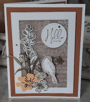
This week's stamping class featured a stamp set called Nested Friends.  (There's only one bird image in it, so I'm not sure why it's called nested "friends.")  I paired it with Honeybee Home and made three cards.

The idea to make this first card is from Gail Ellis on Pinterest.  I like a lot of her designs and use of color.  The background is Cinnamon Cider and the white frame is made using the Stitched Rectangle dies.  I embossed a piece of vellum with the Timeless Texture folder and adhered it to the back of the frame.  Then I put it on my card using dimensionals to give it some lift and interest.  

The flower is from Honeybee Home, as well as the the sprigs.  One of the flower cut outs is acting like a little branch for the bird to sit on.  The flower cut out is from Hand Penned dies and the tan flower is from Regency Park, using the punch for the trio of flowers.

Hello There sentiment is from Nature's Prints.  I love the soft, look of this card.  

For the second card, I used Blushing Bride cardstock, with a layer of embossed white and some papers from Abigail Rose papers.  I added the nest and the bird from Nested Friends along with some cut out eggs that I speckled.  The oval frame is from Framed Florets.  The saying is from Honeybee Home and the flower is from Regency Park.  I got the idea for this card from Kim McGillis.

The third card uses more designer papers from Abigail Rose and the cut outs from Nested Friends.  The pink sprig is from Honeybee Home and the flower from Regency Park.  This idea is from Julie Gilson.

I have to say that I love all of the new products from Stampin Up.  They make paper crafting such a pleasure.  You can mix and match the stamp sets and the dies for truly amazing cards and projects.  I am so glad to be a part of the Stampin Up family.  

This summer will be 20 years for me.  Crazy, I know.  


Saturday, June 11, 2022

Quiet Meadow Cards

I like to buy stamp sets that come with dies that can be used for all sorts of things.  This stamp set, Quiet Meadow and its coordinating dies, Meadow Dies, comes with so many different shaped cut outs.  You can use the dies in this set for backgrounds on a variety of cards, especially flower cards.  There are large dies, fern dies, tall dies, flower dies, butterfly dies and more.  It's really one of the best sets to use.

I love the simplicity and soft colors in this card.  I got the idea from Gina Connor.  It's hard to see, but I embossed the white piece with the Subtle folder.  The butterflies are cut in both cardstock and vellum on the first card to give it a fluttery look.  

On the first card, I put gold ribbons and champagne rhinestones and on the second card, I used silver twine and silver rhinestones.  The first card has dimensionals under the leaf cut out and the second card has them under the gray flower.

For this next card, I wanted to do something simple.  You can see that I cut out the design and used that as the focal point.  I used paper from the Fine Art Floral designer package for the background.  The vertical stamp is from the Create With Flowers set in last year's catalog.  


This is the same card, only using a softer color from the designer pack.  I like the darker one better; it gives the card more contrast and really highlights the cut out.  The idea came from Viv's Visuals on Pinterest.  

For this card, I demonstrated a new embossing technique.  Run your cardstock through an embossing folder and rub it every so gently with the Versamark pad.  Pour on your powders and heat it until they melt.  I used gold embossing powders on my card and I love the vintage look that it gives the card!  This card was a big hit in my stamping class.

I got the idea from Kayla McCreadie.  I can't wait to try this idea on other cards, too.  The cut out flowers are cut from white and gold vellum, giving the card a soft look.  

After I made the card, I thought that it needed vanilla cardstock instead of the white. I softened the edges of the scalloped piece using a blending brush and some gold metallic Encore ink that I had from years ago.


And lastly, I made this sparkly card using copper foil paper for the accent layer and for the small flower cut outs.  The large flower cut out is sparkly rose-colored foil paper that I had from a few years ago.  I stamped the background of the rectangle with the script stamp from Very Versailles.  Then I added some of the script from Quiet Meadow to fill it in.  I embossed the flowers using copper embossing powders.

After I made the card, I thought this one would also look nicer in the vanilla cardstock.  Then I found some shiny papers from Love You Always designer paper pack.  The cards are much prettier in person.  The heat embossing and the foil papers give the cards a wonderful look.  I got this idea from Claire Daly.  

I loved using this set of wonderful dies.  I will be making more things with them, for sure.  Which card did you like the best?  They are all different techniques using the same stamp set and dies.  


Sunday, February 28, 2021

Touch of Ink

Touch of Ink is one of the stamp sets offered in the Sale-a-Bration promotion through Stampin Up.  It has pretty nature images and this week, I made 4 cards using the set.  

For this purple card, I used Highland Heather card stock and some gingham paper from last spring. I think anything made with gingham adds a touch of spring to it.  I saw this idea from Jan B on Pinterest.  

Next up is a pretty card made using Petal Pink with embossing in the background.  I added a scalloped cut out layer and then colored in some of the images with Stamping Blends, cut them out and added them on top.  I saw this idea from Martin's Mayhem.  I love how she added the white die cut strip and the white embossed banner for a different look.

For this card, I used the Ombre designer papers from the Sale-a-Bration catalog.  I added the oval focal point and the hummingbird.  He looks a bit psychedelic, don't you think?  I got this idea from Katie Drew.

This last card features paper from the Flower and Field designer paper pack.  I don't usually like to work with dark colors, but I saw this idea from Christy Gridley and decided to try it.  I actually love how it came out.  Different for me, but striking.  It kind of reminds me of a summer night when the fireflies are out.  :)

Four completely different cards, but I like using this set.  


Wednesday, April 15, 2020

Under My Umbrella


This past week was very rainy here in upstate NY.  What better thing to do on a rainy day than to make Rainy Day cards?  I took out a new stamp set called Under My Umbrella and made some cute cards with it.  I love this set because it comes with a punch.  And you all know that I love my punches.  They're so quick and easy.  :)  I got these ideas from Mena Green.

The punch only punches out the umbrella and the handle.  So you do have to cut out the boots and the flowers, but they don't take long.  For this card, I colored in the boots and the umbrella, but you really don't have to because you can punch out cute patterns from any designer paper.   I got the idea for this card from Jaimie Barbarczy.

This folded umbrella works with the punch also.  The paper that I used for this is from last year's Tranquil Textures.  I watercolored the background and them stamped the raindrops onto it after it dried.  I got this idea from the Stampin Up catalog.


Then I saw on Pinterest that Sandy McCullough had added the little Meerkat to the boots!  This makes the card even cuter.  I had so much fun today working on these.

I used the Best Dressed designer papers for most of the cards.  I had a lot of gingham left over from last year, so I added that, too.  And the sayings are all great.  You can use these cards for any day.

What do you think of this set?  I think I'm going back into the craft room to make more.

Saturday, April 20, 2019

More Needlepoint Nook

Here is another card made with the Needlepoint Nook stamp set.  I got the idea for this card from Chris Smith on facebook.  It's hard to tell in the photo, but I embossed the background with the stitched thinlit.

The bottom scallop is one of the cut-outs from the Nook suite.  I added the stitching along the bottom with a blue marker.  I love how the cut out reveals the pretty blue stitched paper along the bottom.

While I was working on these cards, I thought that it would make a nice Sympathy card, also.  Although I didn't actually do any stitching, I had a lovely afternoon in the Needlepoint Nook of my craft room.  :)

Friday, October 12, 2018

It's Like Walking Down a Country Lane

 Last week's stamping class featured a new stamp set, Country Home.  It has such sweet images in it, like a milk can and a retro pitcher.  The paper coordinates nicely with it, to bring out that sweet country feel.

The Tin Tile embossing folder has such an awesome look to it - it makes paper look like decorative metal tin.  We embossed some galvanized metal paper with the folder and take a look at the first card, especially in the first photo.  I love these colors together. 

The second card has cotton balls on it to complete the look of the cotton that is in the milk can.  I colored in the images using the Stamping Blends.  I love these cards so much - I think I need to make some more projects with these colors and this stamp set!

Rich Razzleberry is the shining color on this card, too.  I embossed the saying with white embossing powders to make it stand out. 

Finally, we stamped the milk can onto colored cardstock so that we didn't have to color it in.  A different look, but still a lovely card.

When I advertised this stamp class, I told the ladies that making these cards would like taking a walk down a country lane.  And boy, was I right!  :)


Sunday, July 22, 2018

Pamper Yourself Gift Box

I belong to a lovely group of Stampin Up demonstrators and we get together once a month to share swaps, make projects and share ideas.  This weekend the ladies will be coming over to my house.  I wanted to share this cute little project that I made as a "swap." 

It's a little box using the Lots to Love framelit.  I wanted to showcase the lady in the tub who is definitely "pampering" herself!  She has a glass of wine and some candles lit while relaxing in her bubble bath tub. 

I used Tip Top Taupe for the card base and some Real Red designer paper to give it some contrast.  The background card stock and ribbon are Early Expresso.  Everything is stamped in Basic Brown to keep the lines from smearing when you color. 

It's hard to tell in the photos (why are they all so blurry?) but it has Wink of Stella on the wine glass, bubbles in the tub, rubber ducky and on the candle flames to make them stand out.

While it did take most of the day to assemble the boxes and paint and cut out the bathroom accessories, I think they came out very well.  And get this, I designed it myself!

You can put a gift card, chocolates, bubble bath, epsom salts, a facial mask or any other "pampering" item in the box.  Cute for a Girls Night Out party favor!